Farewell Wizard
 Wizard Entertainment announced on Monday that it has ceased publication of its Wizard and Toyfare magazines, bringing an end to one of the pillars of my childhood.
Although I hadn’t bought the magazine in years or read it in months, I’m sorry to see it go. It was a big part of my adolescence – I still have a stack of issues sitting at my dad’s – and helped shape me as both a writer and as a person.
Since 1991 Wizard has been the go-to source for most comic book fans. The monthly magazine featured news items, interviews, how-to articles, reviews, previews and just about anything else you can imagine involving comics, all in an irreverent and fun package.
It was that flippancy and sense of humour that has informed my personal and professional style. Although journalism is rarely an appropriate venue for sarcasm, it certainly has its place on this blog, on my Twitter feed, on Facebook and most especially in person.
Every so often I’m reminded of one of Wizard’s jokes or particularly funny turns of phrase and I still laugh.
For example, like the Marvel Comics of the 1980s and early 1990s, Wizard always had a page dedicated to the antics of its bullpen of staff.
In that space they often discussed the escalating prank war amongst the magazine’s different departments, including a gag where three staff members took thousands of photocopies of their faces and plastered them all over their rival’s offices. Into file folders, on computer screens, covering phones, cut into slices and taped to the individual slats of venetian blinds. Everywhere.
Years later, when my friends Wes and Ruben wanted to prank our friends Kate and Hannah, I knew just what to do. Nearly $150 at Kinko’s and hours in the girl’s apartment later, and we’d covered every square inch with black and white copies of our faces, all with the staff of Wizard as our inspiration.
But the slick magazine’s reach extended far beyond its sophomoric humour.
As Matt Demers of NerdGirlPinups.com points out “Wizard showed me that a person could take something that he/she enjoyed and make a living at it. The articles were written with passion and flair, and exposed me to the deeper side of comics' fandom.”
Basically, being a writer for Wizard was what I aspired – really, still hope - to be. It helped show me that it’s possible to make a living being creative and doing what you love.
But as much as Wizard was a positive influence on me and my work, it also served as a cautionary tale in two respects.
First, it was often criticized by comic fans and professionals alike for essentially becoming a catalogue for the industry’s two biggest publishers - Marvel Comics and DC Comics - and generally ignoring smaller or independent printing houses.
Obviously, this underscored the need not just for journalistic integrity, but to have diversity in your coverage. If you’re going to develop a beat and report on something like the comics industry, you should not neglect any corner, no matter how insignificant it may seem.
Second, despite its decidedly nerdy demographics, Wizard never really expanded on to the internet. Yes, they had a website but it never had any news or really any content beside subscription information or the details on their series of conventions.
I think this was their ultimate undoing. Wizard was in a position to get in on the ground floor of the Internet boom with a hardcore audience that would presumably be web savvy. WizardUniverse.com could’ve been ComicsAlliance nearly a decade before there was a ComicsAlliance.
Instead, publisher Gareb Shamus stuck with Wizard’s out-dated print-only business model. Ironically, they plan to launch WizardWorld.com, an online comics magazine in February, but it’s obvious to everyone that the cat is out of the bag with several competitors already well-established online.
Farewell Wizard, it’s been fun. You taught me a lot about comics, writing and journalism both in life and in death, but your time had come.
The Box of Punishment Lives On
As many long-time readers of this blog know, I am a fan of comic books.
I’m particularly drawn to more realistic characters like the Question, Batman and especially the Punisher. I appreciate the fact that it’s just a small leap of faith to imagine a world where these guys really exist.
That gritty realism also increases the dramatic tension since, ultimately, the hero is mortal. Unlike Superman, Thor or Wonder Woman, the stakes are higher because, if not for the hero’s skills, he’d be dead.
Recently, I bought a little piece of comic book blogosphere history when I purchased the first 68 issues of the Punisher ongoing monthly series from Chris Sims of the Invincible Super-Blog, War Rocket Ajax and Comics Alliance fame.
These magazines – the entirety of Mike Baron’s run as writer on the title – were part of Chris’ infamous Box of Punishment when he read every book and comic starring Frank Castle he could get his hands on.
Now, I haven’t made my way through all these just yet, but something is striking about them.
Namely, these covers are fantastically bad. They’re not just unrealistic – diminishing the book’s charm – they’re laughably over the top.
Here are the five worst, in chronological order:
 The Punisher #1 – A classic cover that grabs the readers’ attention as the Punisher breaks up a drug deal by levelling a bazooka at a criminal…. at point blank range.
Never mind that missile launchers are probably too heavy to hold with just one arm, the real concern is that when Frank Castle pulls the trigger on that bad boy the kick will send him flying off his precarious perch on the fire escape.
Should the Punisher somehow manage to hold on, he’ll undoubtedly be killed by the explosion and ensuing shrapnel from the incinerated corpse of his victim and the building itself.
This is the tactical genius that strikes fear in the hearts of the Marvel Universe’s criminal brotherhood? Also, please note his all white boots and gloves, ideal for sneaking around in the dark alleys of New York City.
 The Punisher #11 - For the next 10 issues the Punisher’s covers were limited to pretty standard fare. Indiscriminantly shooting off rounds at unseen targets… Cavalierly tossing grenades at the reader… You know, reasonable stuff.
But then comes issue #11 (“Second Sight”) where our hero travels to Mexico to exercise his vengeance on human smugglers who left their cargo to die of dehydration in the desert wastelands of west Texas.
After drinking some mescal and going on a vision quest of sorts, Frank and the local brujo dispatch the people traffickers with a variety of weapons including a pitchfork and an antique cannon, apparently from the time of the Conquistadores.
You can see the cannon right there on the cover: the Punisher has ripped it off its moorings with his bare hands and is apparently going to fire it from his hip like an automatic rifle.
Again, it’s a physically impossible feat. The cannon, presumably made of cast iron, would easily weight a thousand pounds. When one of these cannons fires it rolls several feet and has to be pushed back into position by an entire crew of gunners. So, allowing that Frank was able to hold it up long enough for it to fire, he and his Mexican lady-friend would be sent flying by the recoil.
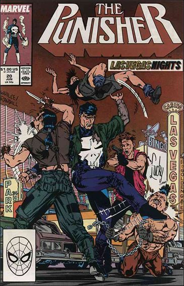
 The Punisher #34 – After two years of reasonably sane covers, including growing a beard to infiltrate a gang of bikers, attacking a correspondence school for ninjas and flipping some punks in Las Vegas (for real) the Punisher had to tangle with his toughest foes yet – the Reavers, the mutant-hunting cyborgs who had (briefly) killed the X-Men.
Their first battle didn’t go so well for Frank, resulting in him apparently becoming a cyborg himself. I particularly appreciate the fact that by the next issue he’s all better again. Because being turned into a cyborg is totally reversible. Just takes a quick overnight surgery and you’ll be flesh and blood again.
Also, for reasons beyond my understanding, all cyborgs and robots in the late 1980s and 1990s were depicted as being a deep green or purple. I really don’t remember metals turning that colour… ever… even in the Neon Nineties.
 The Punisher #42 – Somewhere around issue #35 the editors at Marvel Comics decided to add some dark humour to the Punisher, edging the books toward self-parody or even camp. For example, puns and pop-culture references were littered throughout the six-part Jigsaw Puzzle storyline the preceded this issue.
When the title returned to one-and-done stories the Punisher’s covers used that dark humour to try and grab the reader’s attention.
Issue #42 is a perfect example of this as Beachhead from G.I. Joe - okay, not really him, but it’s the same style of balaclava as the cynical Joe trainer - holds a gun to a hostage’s head and screams “DROP IT PUNISHER… OR THE KID’S DEAD!” to which Frank Castle, bereaved husband and father, replies “What do I care? My kid is already dead!”
There’s so much to enjoy here: the Punisher’s shockingly unconcerned approach to the safety of innocent victims of violent crime, the hostage’s panicked expression as they realize they’re totally screwed, the background completely devoid of any scenery. It’s all a rich tapestry.
But what I like best is that it’s firmly established in the Punisher canon that Frank Castle had two children. Apparently, in the heat of the moment he’s realized that he really only ever loved one of them.
 The Punisher #52 – Skipping over a few covers that see Castle strapped to the muzzle of a giant gun, standing on the roof of a cab before shooting the passenger and fighting neo-Nazis, we leave on a high note: “Maternity Ward”.
Excuse me, “Maternity War”. You see, a bullet hole has obscured the “d”.
Yes, the Punisher has gotten into a gunfight in the midst of a hospital’s maternity ward and he’s either trying to rescue four babies from the marauding baddies or maybe add on to his body armour.
I truly admire the editor’s dedication to the cover’s theme, from the wan smiley faces on either side of the issue’s title, to the bullet-riddled “Baby on Board” sign in the postmark box. Even the publisher’s logo has a small child draped in the Punisher’s uniform and brandishing an Uzi. Such an impressive eye for detail!
It’s amazing how damn goofy these covers are, especially since this is supposed to be one of the most realistic characters in comics history.
Graphic Novel Review – Scott Pilgrim by Bryan Lee O’Malley

Um, wrong Scott Pilgrim.
Hello. My name is John and I’m a male comic book fan from Toronto.... and, um, I don’t really like the Scott Pilgrim series of graphic novels.
I know, that’s total heresy to some people, but it’s true. I do not enjoy the series. Although I enjoyed the film starring local hipster hunk Michael Cera, I just can’t get into the graphic novels, try as I might. They’re just not my bag.
For the uninitiated: Scott Pilgrim is about the blossoming relationship between the titular hero and his American sweetheart Ramona Flowers. To win the day and the girl, all Scott needs to do is get a job, mature as a person and, oh yeah, defeat her seven evil exes in fights to the death.
The books are heavily influenced by anime, comic books and especially video games. Scott’s band is called “Sex Bob-omb”, combining Tom Jones with one of the more obscure villains from the Super Mario games. There’s a lot to like in that concept, but it just never clicked for me.
This isn’t about going against the grain either. I’m not saying I dislike it just to fly in the face of indy scenesters everywhere. I was actually on board with the series pretty early on. In fact, when I was in undergrad I worked at a very large bookstore in downtown Toronto one of my co-workers was wild about Scott Pilgrim.
When she learned that I was a fellow comic book nerd she insisted I catch up on the series - at that point only three of the six books had come out – and so I dutifully bought the first volume (Scott Pilgrim’s Previous Little Life) and demolished it in about 30 minutes of dock-side reading at a cottage.
There was certainly a lot to like about the book. It had its funny moments, particularly the climactic battle with Matthew Patel, and the characters had some charm. As a young man in Toronto working in a mind-numbing retail job, I had some sympathy for Scott.
Unfortunately, it was also crowded with too many of Scott’s friends and peers, and O’Malley’s artwork wasn’t sophisticated enough to make it clear who was who. Characters bled together on the page and in my mind.
Also, although I could I identify with some aspects of his life, Scott is the kind of person I’ve got little patience for in real life. He’s directionless, insensitive and oblivious to his surroundings. His friends are huffy and prone to inexplicable bouts of anger while hating their dead-end jobs.
If they were real people, I’d go out of my way to avoid them.
So after that first book I gave up on the series and moved on. When inevitably confronted by a hysteric Pilgrim-fan - they are legion in Toronto’s Annex neighbourhood - I’d politely shy away from the subject and explain I was really behind on my reading.

Sight gags like this are great, but they're not enough to redeem these books.
But the film trailers grabbed my attention and I went to see the Edgar Wright-directed movie on opening weekend. After all, it’s a movie that prominently features my hometown and I’m a sucker for all things Toronto.
It was smart, fun and moved quickly. The acting, particularly Cera in the title role and Kieran Culkin as his roommate Wallace Wells, was sharp and witty. I loved it.
That experience, coupled with reports from many friends that the art and writing improved with each book made me think I should give the series a second chance. I borrowed the remaining volumes from the library -Wychwood Branch, a prominent location in the series - and see if the books could redeem themselves.
Well, they didn’t. I still didn’t really like any of the books.
Although I got a better handle on who all the characters were, many were still incredibly whiny. There were too many throwaway scenes, too many pages of Scott lying around on his couch in a sulk. Characters fly into rages for no apparent reason, storming off dramatically to prove their invisble point.
I hated that kind of histrionics when I was in my early 20s, and I’m not keen to re-live it in graphic novel form.
Don’t get me wrong, there are some positives in these books. As far as a coming-of-age story, Scott Pilgrim is very good. There is a real sense of maturation in our hero and he really does develop into a more sensitive and thoughtful person. His complex relationship with Ramona is handled by O’Malley with a deft touch and there is much to be learned from both of them.
The books are also occasionally entertaining. There are pages and scenes that are legitimately funny and seeing stores, restaurants and clubs that I’m intimately familiar with printed on the page never really got old. But all that isn’t enough to overcome some of the deep flaws in this series.
Bryan Lee O’Malley’s Scott Pilgrim series is a fine entry point to the world of graphic novels, but there are at least a dozen other books that a neophyte fan could start with that would be more satisfying. It’s probably best to just watch the Michael Cera movie and then seek out recommendations that are like the books.
Follow Friday – the Twitter Bullpen

A sample of a classic Bullpen Bulletin item.
Growing up I was fortunate to have access to my dad’s wonderful Silver Age collection of comics. Also, since I grew up in the 90s, I could pick up relatively cheap back issues from the medium’s second golden age, the 1980s.
As a result I’ve been exposed to some of the real magic of Marvel Comics. Obviously, the stories and artwork is the major draw of their library, but one of the really attractive things about these eras was the infamous Bullpen Bulletins.
In short, the Bulletins were a newsletter inserted into all of Marvel’s monthly titles that talked about the comings and goings of their roster of writers, artists and editors.
Really, it was an invention of editor-in-chief Stan Lee to promote new titles and new talent. The Bullpen Bulletins were always over-the-top and Barnum-esque but it was also entertaining and made you feel like you were right there with your favourite creators.
Marvel discontinued the feature in 2001, and I can’t say that I blame them. After all, the Bullpen itself had been dispersed by the advent of digital technology allowing a lot of freelancers to work from home.
Further, today’s creators are able to float between DC Comics, Marvel, Image, Dark Horse and other publishers, meaning that the esprit de corps that was at the heart of the Bulletins was seemingly at an end.
Twitter has rekindled that sense of camaraderie and taken it to the next level. Instead of getting to read monthly highlights of Bullpen sessions, comic book fans can now follow the jabs, jokes and work of all their favourite creators on a minute-by-minute basis.
The queen of the comics Twitter-verse has to be Gail Simone, the writer of Secret Six and Birds of Prey. She is one of the most active Tweeters out there. One of her regular “features” is to antagonize her fellow comic creators and hilarity often ensues.
Warren Ellis is the author of many books and magazine articles, but is also known for his comics work including Transmetropolitan, Nextwave, Planetary and Hellblazer. His Tweets are jovially cantankerous as he playfully abuses his followers.
A more light-hearted creator is Dan Slott, the current scribe of Spider-Man. He also penned a tragically short-lived run on the Mighty Avengers which recently concluded. He often discusses his writing process and things he loves about his job. It’s a fun read.
One of my favourite comic book writers is Kurt Busiek, the author of the brilliant creator-owned Astro City. He’s done a ton of other work for just about every comic publisher you can name. If you’ve never read it, his run on the Avengers with master illustrator George Perez is some of the best comics work ever.
Finally, there’s the duo of Ed Brubaker and Matt Fraction, who have turned the Marvel universe on its ear in the past few years.
Brubaker just finished an incredibly strong run on Daredevil and continues to pen Captain America. Fraction is the current mind behind the X-Men, Thor and the Invincible Iron Man. The two collaborated on the Immortal Iron Fist, a joy to read that ended too soon.
There are myriad other creators on Twitter, but these are a few of my preferred feeds. It’s fun and exciting to see the Bullpen continue on, at least in spirit, in the digital age. If you’re a fan of comics, you should try looking up your favourite writer and artist and get to know them just as Stan Lee once envisioned.
Graphic Novel Review: Captain America: Winter Soldier vol. 1 & 2

Captain America: Winter Soldier vol. 2
One of my New Year’s resolutions was to read more comic books and graphic novels. Hardly a self-improvement project, I know, but I want to get down with my nerd self.
My first graphic novel of 2010 is Captain America: Winter Soldier vol. 2, allowing me to complete the first story arc of Ed Brubaker’s popular run on one of Marvel Comics’ most recognizable characters.
I’ve never been much of a Captain America fan. I prefer grittier characters like Batman or the Punisher, so his squeaky clean image never appealed to me. And since I’m Canadian, all the patriotic beats were lost on me.
But Brubaker’s Winter Soldier storyline sucked me in. I’d heard that the new Captain America series was going to be bringing back Bucky, a character who had been dead since the end of World War II, and it hooked me.
This was a Big Deal to comic fans. Bucky had been Cap’s 16-year-old sidekick during the war, but was tragically killed when a missile he was trying to disarm exploded in mid-flight. The same incident dropped Cap into the frigid North Sea, freezing him until the 1960s.
The death of Bucky had always been cited as the reason why Marvel’s superheroes don’t have teenaged sidekicks - unlike their DC counterparts - and it added a sense of realism to the company’s mythos.
For Brubaker to be retconning a fundamental element of Marvel Comics seemed like heresy, albeit an intriguing act of rebellion.
Captain America: Winter Soldier Book One and Two brings together issues 1-14 of the fifth monthly series to star Steve Rogers. They revolve around a terrorist attack that was apparently perpetrated by a mythical Cold Warrior known as the Winter Soldier who may actually be Cap’s former partner Bucky.
Resurrection storylines have become commonplace in comics, a constant recycling of characters who had been killed for dramatic effect, only to return. It’s a trend that is holding back a medium that I love. But Brubaker handles the return of the long-dead hero with a deft hand that provides not just a plausible explanation for his survival, but an engrossing story.
Interspersed with action, character moments and plot developments, Winter Soldier begins with Captain America becoming angry and frustrated with the inability of the United States government to attack countries that sponsor terrorism. The detonation of a Weapon of Mass Destruction in Philadelphia leaves a trail that leads to former Soviet general Aleksander Lukin, and his shadowy operative the Winter Soldier.
Even the name Winter Soldier is clever work by Brubaker. It’s a reference to the loyal American revolutionaries who stuck with George Washington over the harrowing winter in Valley Forge, but also to the Winter Soldier Investigation, a Viet Nam era examination of atrocities and war crimes committed by the United States Armed Forces.
Brubaker seamlessly connects the Second World War, the Cold War, modern terrorism and Captain America’s complex continuity. It’s not just that he brings in plot points from every era of Cap’s 70 years of existence, but the pacing and style of the book draws heavily on these aspects of the character’s history.
To me, a classic Captain America story has him and a partner rushing off into danger to stop a catastrophe from befalling the United States or the world. Winter Soldier is no different, with Cap rushing to stop Kronas Corporation with the Falcon riding shotgun.
Steve Epting’s art work in this series is fantastic. I can’t think of a current comics creator who makes better use of inking and colouring techniques. His characters are expressive and natural in conversation, and dynamic and fun during action scenes.
In particular, the way he draws the acrobatic Captain America jumping, rolling and bouncing in fight scenes is thrilling.
Winter Soldier breaks an old comic fan saying: “No one stays dead, except Bucky and Uncle Ben.” The phrase refers to the fact that Peter Parker’s uncle and Captain America’s sidekick must stay dead because their loss is what, in part, forms the hero we know today.
I never thought I’d see the day where that axiom was successfully reversed, but the Winter Soldier saga does it.
The return of James “Bucky” Buchanan Barnes was enough to catch my interest and buy the first volume of Captain America: Winter Soldier, and the gripping story has lead me to the rest of the series. Brubaker’s writing isn’t some gimmick. It’s some of the best mainstream superhero comic work I’ve ever read.
Archives
- February 2014 (1)
- June 2012 (1)
- January 2012 (1)
- December 2011 (1)
- November 2011 (2)
- June 2011 (3)
- April 2011 (2)
- March 2011 (2)
- February 2011 (5)
- January 2011 (5)
- December 2010 (3)
- November 2010 (11)
- October 2010 (11)
- September 2010 (7)
- August 2010 (10)
- July 2010 (10)
- June 2010 (5)
- May 2010 (14)
- April 2010 (18)
- March 2010 (24)
- February 2010 (22)
- January 2010 (20)
Categories
- Books (18)
- Comics (15)
- Food (2)
- Movies (3)
- Music (2)
- Personal (4)
- Reading (22)
- Site administration (7)
- Sports (143)
- Television (2)
- Video Games (2)
- Writing (23)