The Box of Punishment Lives On
As many long-time readers of this blog know, I am a fan of comic books.
I’m particularly drawn to more realistic characters like the Question, Batman and especially the Punisher. I appreciate the fact that it’s just a small leap of faith to imagine a world where these guys really exist.
That gritty realism also increases the dramatic tension since, ultimately, the hero is mortal. Unlike Superman, Thor or Wonder Woman, the stakes are higher because, if not for the hero’s skills, he’d be dead.
Recently, I bought a little piece of comic book blogosphere history when I purchased the first 68 issues of the Punisher ongoing monthly series from Chris Sims of the Invincible Super-Blog, War Rocket Ajax and Comics Alliance fame.
These magazines – the entirety of Mike Baron’s run as writer on the title – were part of Chris’ infamous Box of Punishment when he read every book and comic starring Frank Castle he could get his hands on.
Now, I haven’t made my way through all these just yet, but something is striking about them.
Namely, these covers are fantastically bad. They’re not just unrealistic – diminishing the book’s charm – they’re laughably over the top.
Here are the five worst, in chronological order:
 The Punisher #1 – A classic cover that grabs the readers’ attention as the Punisher breaks up a drug deal by levelling a bazooka at a criminal…. at point blank range.
Never mind that missile launchers are probably too heavy to hold with just one arm, the real concern is that when Frank Castle pulls the trigger on that bad boy the kick will send him flying off his precarious perch on the fire escape.
Should the Punisher somehow manage to hold on, he’ll undoubtedly be killed by the explosion and ensuing shrapnel from the incinerated corpse of his victim and the building itself.
This is the tactical genius that strikes fear in the hearts of the Marvel Universe’s criminal brotherhood? Also, please note his all white boots and gloves, ideal for sneaking around in the dark alleys of New York City.
 The Punisher #11 - For the next 10 issues the Punisher’s covers were limited to pretty standard fare. Indiscriminantly shooting off rounds at unseen targets… Cavalierly tossing grenades at the reader… You know, reasonable stuff.
But then comes issue #11 (“Second Sight”) where our hero travels to Mexico to exercise his vengeance on human smugglers who left their cargo to die of dehydration in the desert wastelands of west Texas.
After drinking some mescal and going on a vision quest of sorts, Frank and the local brujo dispatch the people traffickers with a variety of weapons including a pitchfork and an antique cannon, apparently from the time of the Conquistadores.
You can see the cannon right there on the cover: the Punisher has ripped it off its moorings with his bare hands and is apparently going to fire it from his hip like an automatic rifle.
Again, it’s a physically impossible feat. The cannon, presumably made of cast iron, would easily weight a thousand pounds. When one of these cannons fires it rolls several feet and has to be pushed back into position by an entire crew of gunners. So, allowing that Frank was able to hold it up long enough for it to fire, he and his Mexican lady-friend would be sent flying by the recoil.
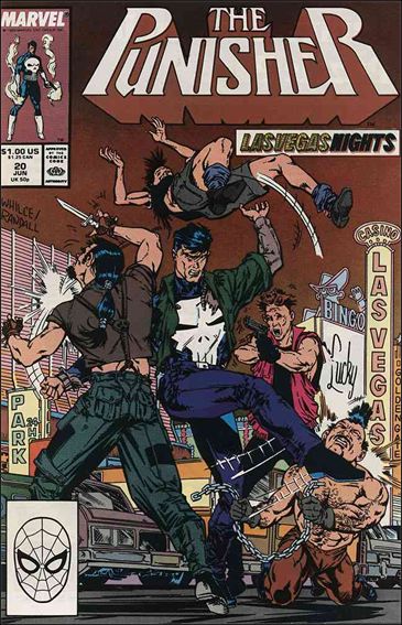
 The Punisher #34 – After two years of reasonably sane covers, including growing a beard to infiltrate a gang of bikers, attacking a correspondence school for ninjas and flipping some punks in Las Vegas (for real) the Punisher had to tangle with his toughest foes yet – the Reavers, the mutant-hunting cyborgs who had (briefly) killed the X-Men.
Their first battle didn’t go so well for Frank, resulting in him apparently becoming a cyborg himself. I particularly appreciate the fact that by the next issue he’s all better again. Because being turned into a cyborg is totally reversible. Just takes a quick overnight surgery and you’ll be flesh and blood again.
Also, for reasons beyond my understanding, all cyborgs and robots in the late 1980s and 1990s were depicted as being a deep green or purple. I really don’t remember metals turning that colour… ever… even in the Neon Nineties.
 The Punisher #42 – Somewhere around issue #35 the editors at Marvel Comics decided to add some dark humour to the Punisher, edging the books toward self-parody or even camp. For example, puns and pop-culture references were littered throughout the six-part Jigsaw Puzzle storyline the preceded this issue.
When the title returned to one-and-done stories the Punisher’s covers used that dark humour to try and grab the reader’s attention.
Issue #42 is a perfect example of this as Beachhead from G.I. Joe - okay, not really him, but it’s the same style of balaclava as the cynical Joe trainer - holds a gun to a hostage’s head and screams “DROP IT PUNISHER… OR THE KID’S DEAD!” to which Frank Castle, bereaved husband and father, replies “What do I care? My kid is already dead!”
There’s so much to enjoy here: the Punisher’s shockingly unconcerned approach to the safety of innocent victims of violent crime, the hostage’s panicked expression as they realize they’re totally screwed, the background completely devoid of any scenery. It’s all a rich tapestry.
But what I like best is that it’s firmly established in the Punisher canon that Frank Castle had two children. Apparently, in the heat of the moment he’s realized that he really only ever loved one of them.
 The Punisher #52 – Skipping over a few covers that see Castle strapped to the muzzle of a giant gun, standing on the roof of a cab before shooting the passenger and fighting neo-Nazis, we leave on a high note: “Maternity Ward”.
Excuse me, “Maternity War”. You see, a bullet hole has obscured the “d”.
Yes, the Punisher has gotten into a gunfight in the midst of a hospital’s maternity ward and he’s either trying to rescue four babies from the marauding baddies or maybe add on to his body armour.
I truly admire the editor’s dedication to the cover’s theme, from the wan smiley faces on either side of the issue’s title, to the bullet-riddled “Baby on Board” sign in the postmark box. Even the publisher’s logo has a small child draped in the Punisher’s uniform and brandishing an Uzi. Such an impressive eye for detail!
It’s amazing how damn goofy these covers are, especially since this is supposed to be one of the most realistic characters in comics history.
An ode to Booster Gold
It’s funny how everyone has a guilty pleasure - a band, movie or book that we love but was hardly a critical or commercial success. Comic book fans are no different. They always have at least a couple of characters that they hold dear to their heart.
I know that I’ve got a few. There’s one name that’s always at top of mind for me though: Booster Gold.
Never heard of him? That’s cool, most people haven’t. Indeed, it’s a running joke on an episode of Justice League Unlimited that everyone thinks that he’s Green Lantern and they’re disappointed when they find out that it’s Booster Gold.
Booster Gold is Michael Jon Carter, a collegiate football star from the far-flung future of the 25th century. He started placing bets on his own games and then threw them for profit. Disgraced, he became a night watchman at a museum that housed artefacts from the so-called Age of Heroes – our modern heroes like Superman and Batman.
With the help of a floating security robot named Skeets, Booster stole equipment and weapons from the displays, and used Rip Hunter’s time machine to travel to the 20th century. When he arrived in the 1980s he used his limited knowledge of historical events to position himself in the right place at the right time and become a superhero brand that would save lives as well as turn a healthy profit.
With Skeets acting as a roving encyclopedia, Booster blunders from heroic episode to heroic episode, often doing more harm than good while trying to create a public image that he can gain from financially. Recently (and somewhat improbably) he's become the guardian of the time stream, trying to maintain order and balance in the universe.

Yeah, it doesn't get more 1980s than this.
There are two things that appeal to me about Booster: his origin and how well he reflects the zeitgeist of the 1980s.
I think that the best fictional characters, superheroes and otherwise, have origins that explain their motivation for the rest of their existence. Sticking to comic books, some Batman, Spider-Man and the Punisher are popular because they are driven by a combination of guilt and anger over the death of their beloved family members.
All three of those creation stories make sense. To an extent, the reader can understand why these guys are dressing in spandex and putting their lives in danger. Their behaviour is clearly motivated by the tragedy in their origins.
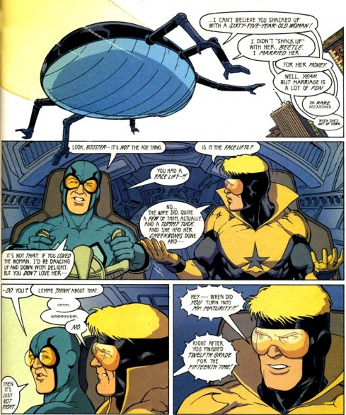
Booster Gold’s driving force is simple: he’s greedy. He covers his uniform with corporate logos, puts money on the stock exchange before big bumps and is generally a glory hog. Or that time he married a sexagenarian for her money. It's not an altruistic reason for becoming a superhero, but it has an inherent logic. You can get what he’s about.
Just as Captain America was ideally suited to the surge of patriotism in the lead up to World War 2 or Marvel heroes like Iron Man and Nick Fury fit the Cold War era, Booster Gold’s 1986 debut was perfectly timed. He was just right for the greed is good, egotistical 80s. He developed as a character into the 1990s, just as corporate monopolies disguised as “synergy” and mass sponsorship became the norm in North America.
Booster Gold is often under-utilized but instantly appealing to anyone who grew up in the 1980s. He’s greedy, funny, a little bit cynical and surprisingly heroic. More than just about any other big name comic book character he fits into our contemporary worldview and, most importantly, he’s believable. The reader can understand why he does the things he does. He’s as real as a man from the future can be, and although he’s a guilty pleasure of mine, I rarely regret it.
Archives
- February 2014 (1)
- June 2012 (1)
- January 2012 (1)
- December 2011 (1)
- November 2011 (2)
- June 2011 (3)
- April 2011 (2)
- March 2011 (2)
- February 2011 (5)
- January 2011 (5)
- December 2010 (3)
- November 2010 (11)
- October 2010 (11)
- September 2010 (7)
- August 2010 (10)
- July 2010 (10)
- June 2010 (5)
- May 2010 (14)
- April 2010 (18)
- March 2010 (24)
- February 2010 (22)
- January 2010 (20)
Categories
- Books (18)
- Comics (15)
- Food (2)
- Movies (3)
- Music (2)
- Personal (4)
- Reading (22)
- Site administration (7)
- Sports (143)
- Television (2)
- Video Games (2)
- Writing (23)